

The most important goal for their rebrand was to create a logo that was easy to read, adaptable for any usage situation; for web or print, and it must incorporate imagery related to the geographic region they serve without being cliché.
We developed a new brand identity that included not just a single logo, but a matching suite of logos that would work in any situation: online, in print, tall or wide formats.
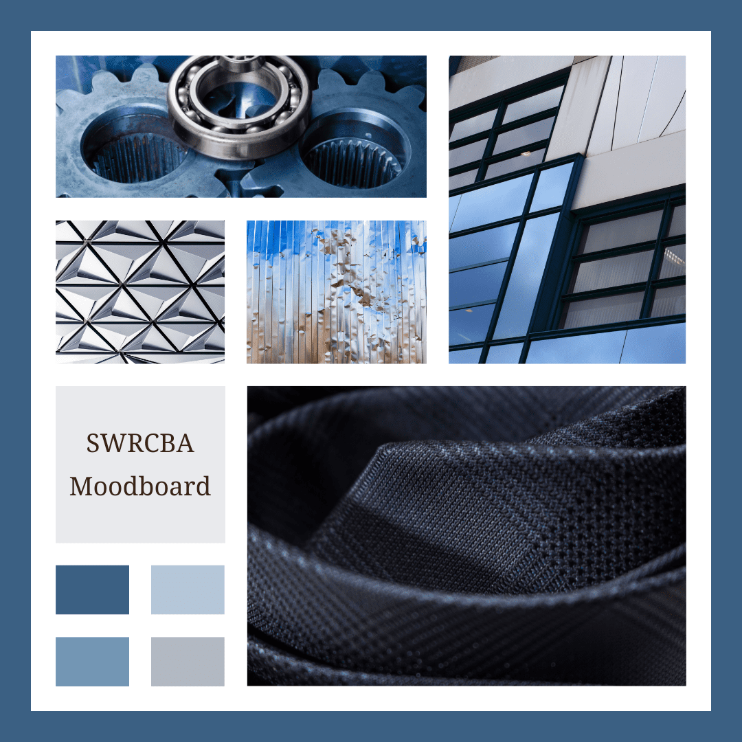
The logo is inspired by the geographic region in which the SWRCBA serves. Inspired by the concept of “morning in the valley”, the soft color pallet invokes the sense of a calm, misty morning. The California Oak trees, predominant in this region, are set in the foreground. The serif font chosen for the initials evokes a sense of longevity and professionalism; and the stylized letter R is a nod to Riverside County; furthering the link between the logo and the geographic location of the area they serve.
Our rebranding mission for SWRCBA had one major goal: to create a versatile logo suite that fits any purpose. We accomplished that by designing logos suitable for both online and print applications. Our inspiration was drawn from the region’s serene beauty, featuring misty mornings and iconic California Oak trees. We opted for a classic serif font to add a professional touch, and the stylized “R” pays homage to Riverside County. This comprehensive rebrand not only achieves visual excellence but also solidifies SWRCBA’s connection to its geographic identity and the communities it serves.